
Home Tour - Upward Spiral
Introduction
There’s nothing more special than designing a forever home for a young family. When this project came across our desk, we were immediately excited about the opportunity to reimagine a traditional Wilmette home with a more minimal and sleek aesthetic that our clients were drawn to. The clients got the home at auction after it had been sitting abandoned for a few years, so needless to say, this house needed WORK. The project was a full-gut renovation with extensive layout changes to create a more functional home. The result is a perfect blend of a modern and minimal home with transitional touches that create a luxe, timeless feel, and we know our client’s young family will be able to age seamlessly in this forever home. We’re so excited to take you inside!

The moodboard for the full home renovation incorporated inspiration images for a neutral, warm palette with organic textures and clean, minimal lines.
The Process


This renovation project required significant layout changes to create a more seamless flow throughout the home with a floor plan that made the most sense for our clients. We had to get creative, reimagining spaces in the home with a functional lens. We decided the space right off of the garage, which was originally a kitchen, would be better purposed as a mudroom. And the new kitchen would be better situated at the back of the home, where the original living room existed. In a full-gut renovation like this one, you have the freedom to reimagine a brand new layout to the home.


A few of the key renderings we presented to our clients gave them a detailed look at the new spaces we designed for their home before any construction began.
The Reveal
We’re so proud to finally reveal the result of this full-gut renovation - Enjoy!


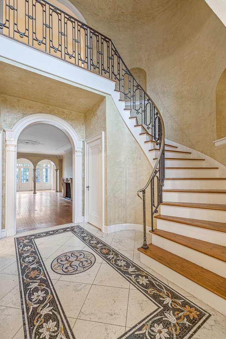
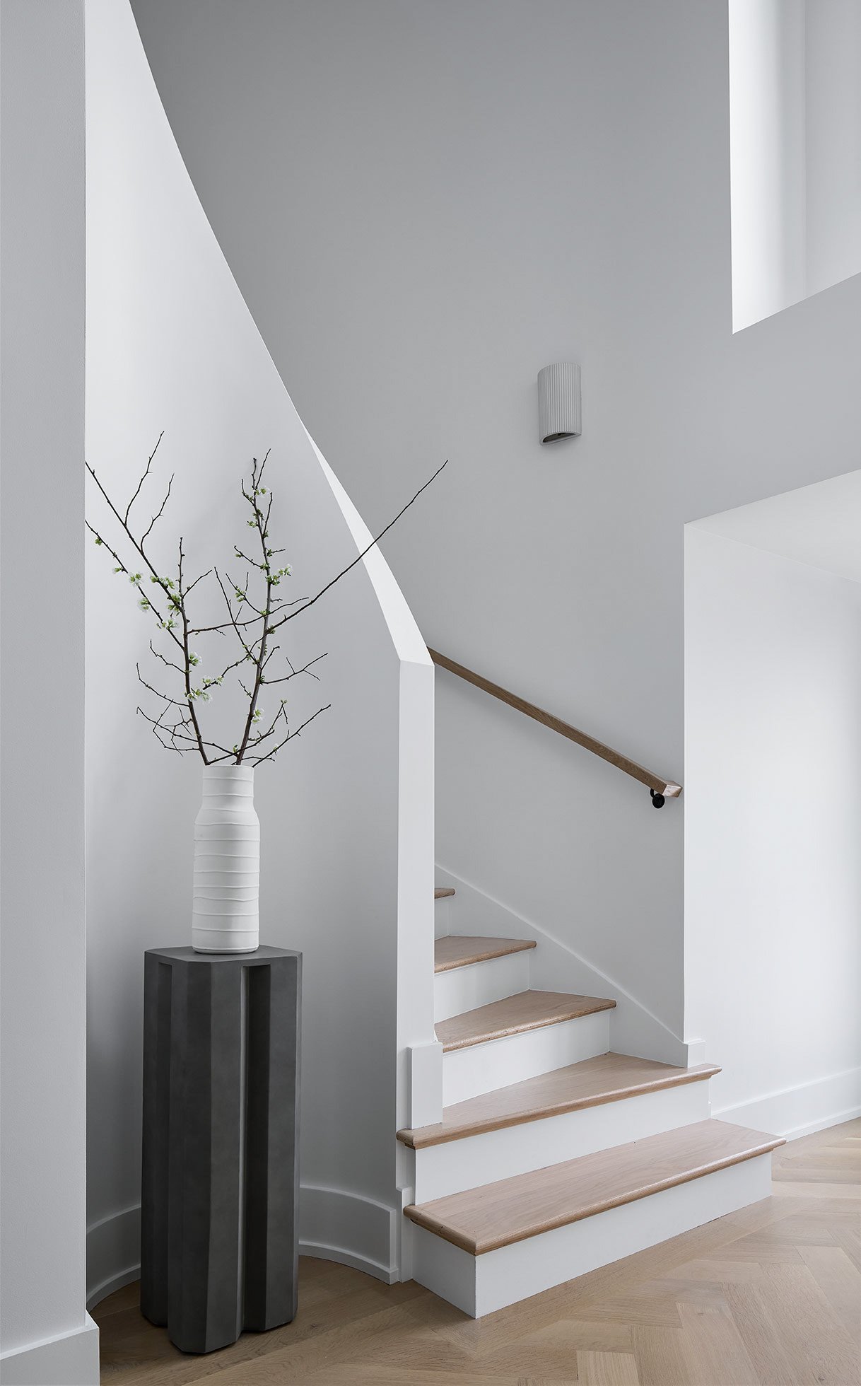
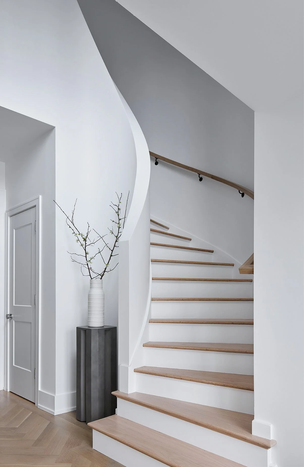
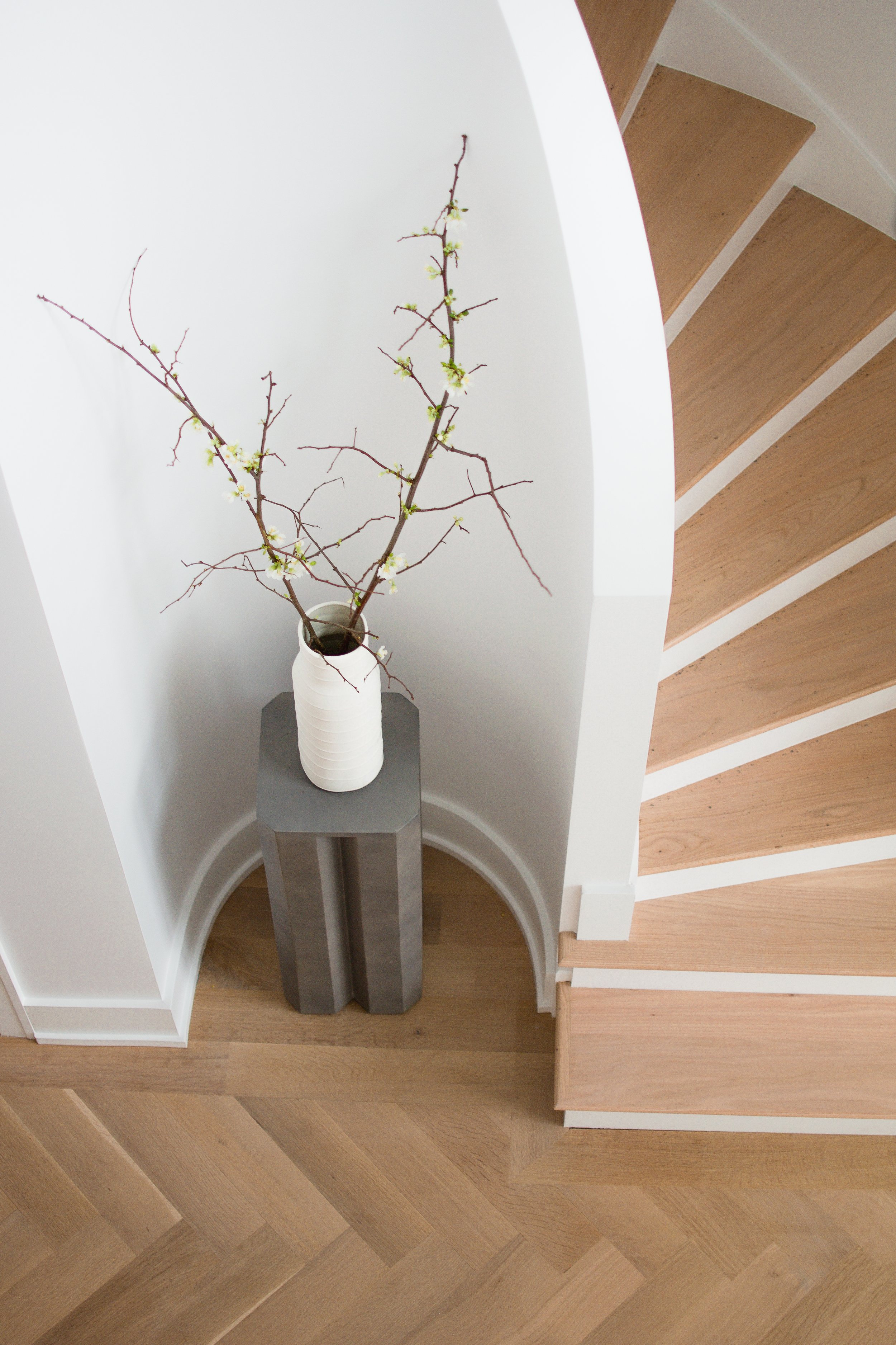
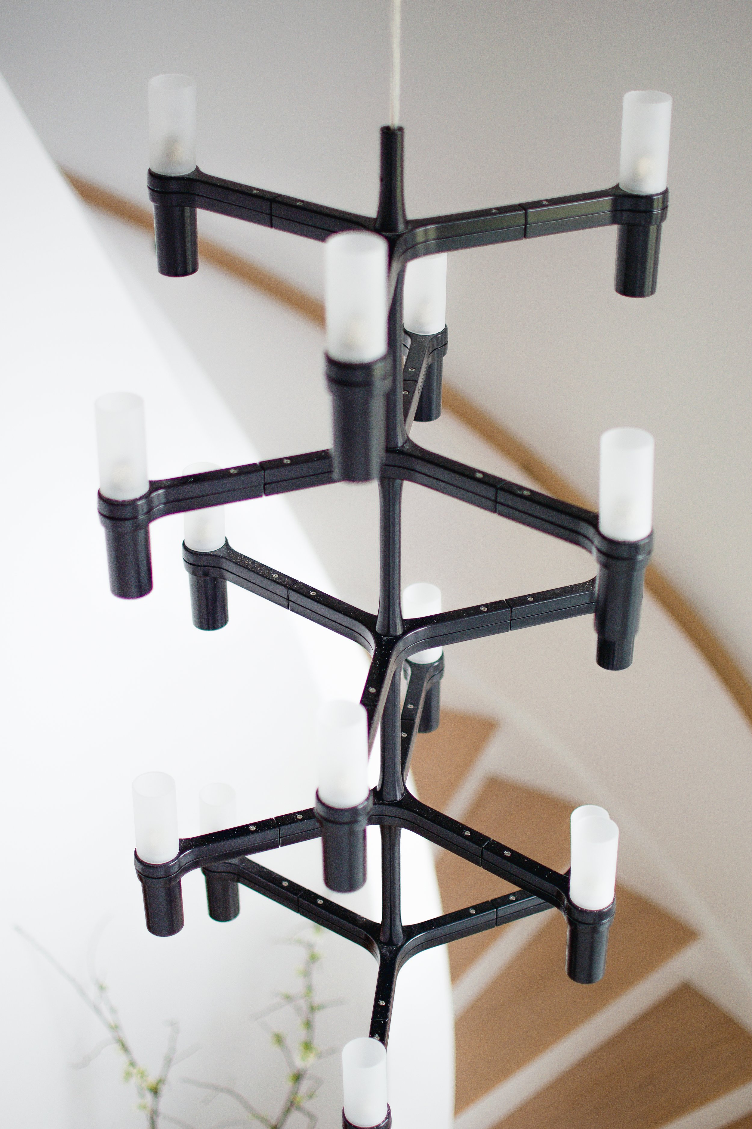
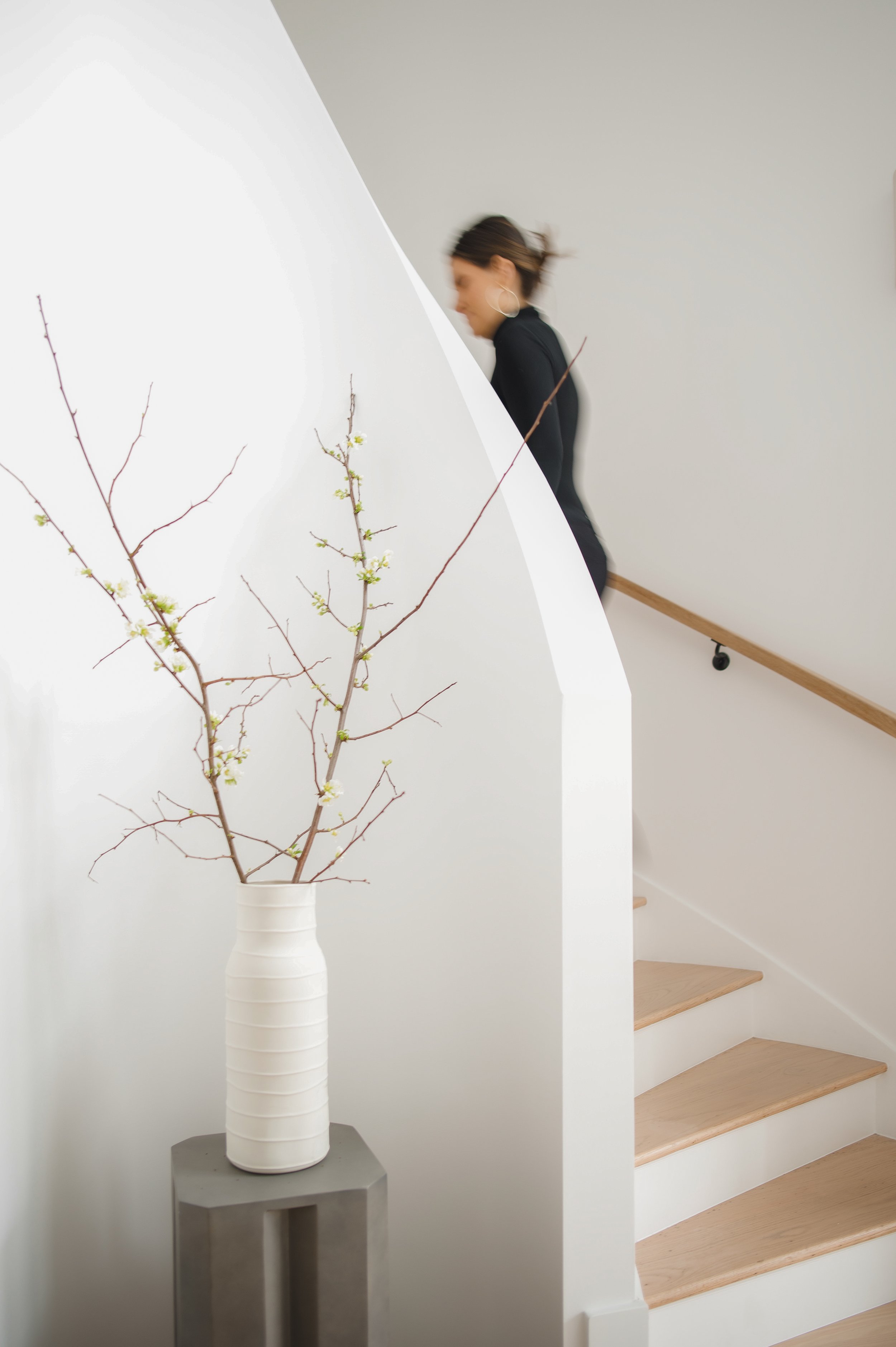
Foyer
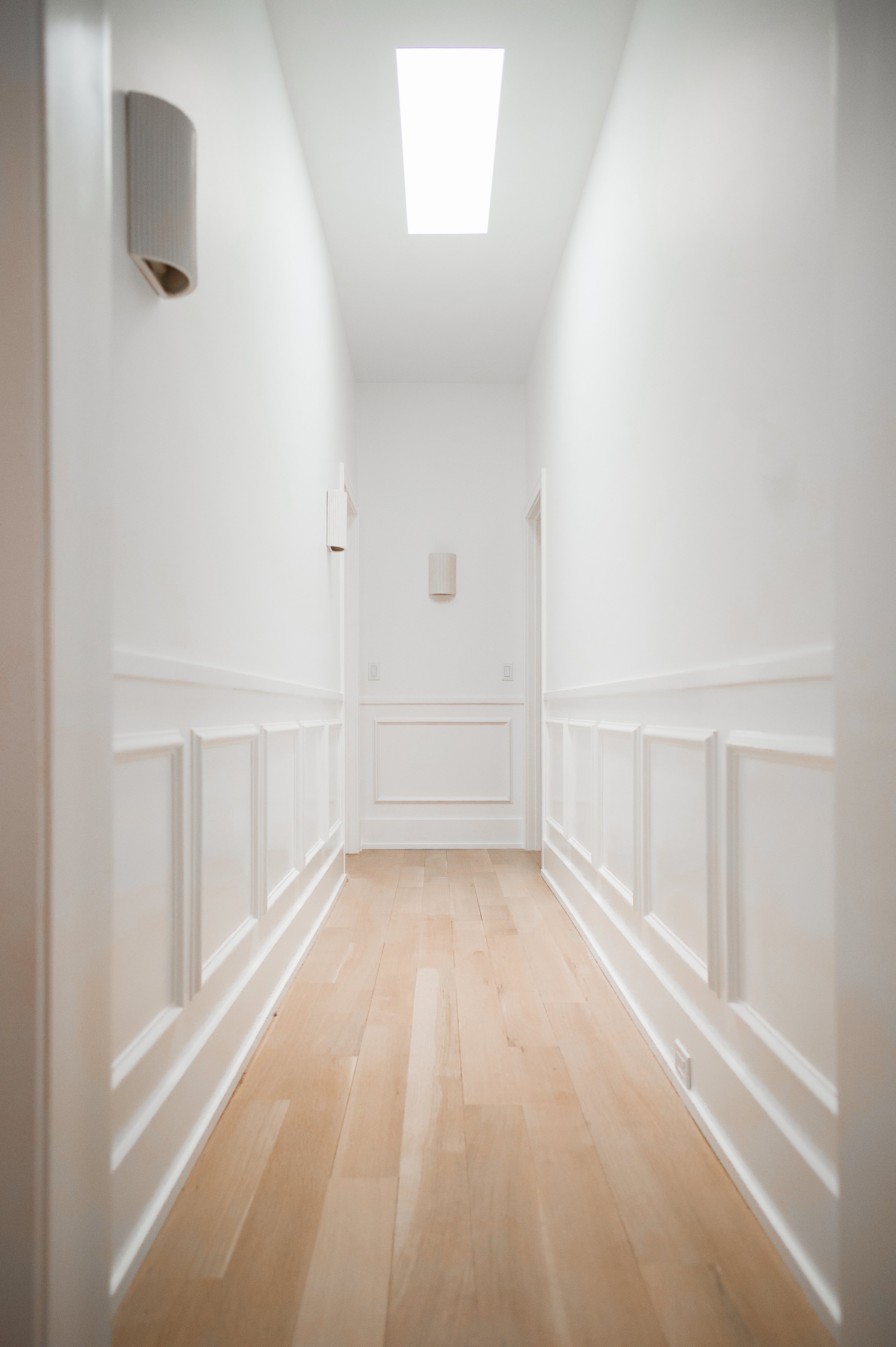
The foyer had one of the most dramatic transformations of the entire project! The existing space had a traditional look with ornate details. We wanted to keep the curved spiral staircase, but introduce a new clean and minimal look that would set the tone for the rest of the home. Minimal designs are often the most difficult to pull off because any imperfections really stand out. This curved stair rail was a brain melter and required lots of careful planning, but we’re so proud of the result. We also replaced the traditional tile floor for a white oak herringbone hardwood to add a warm and inviting feel to the space. While the details in this space are minimal, they still make a strong impact and draw the eyes up to celebrate the incredible ceiling height.
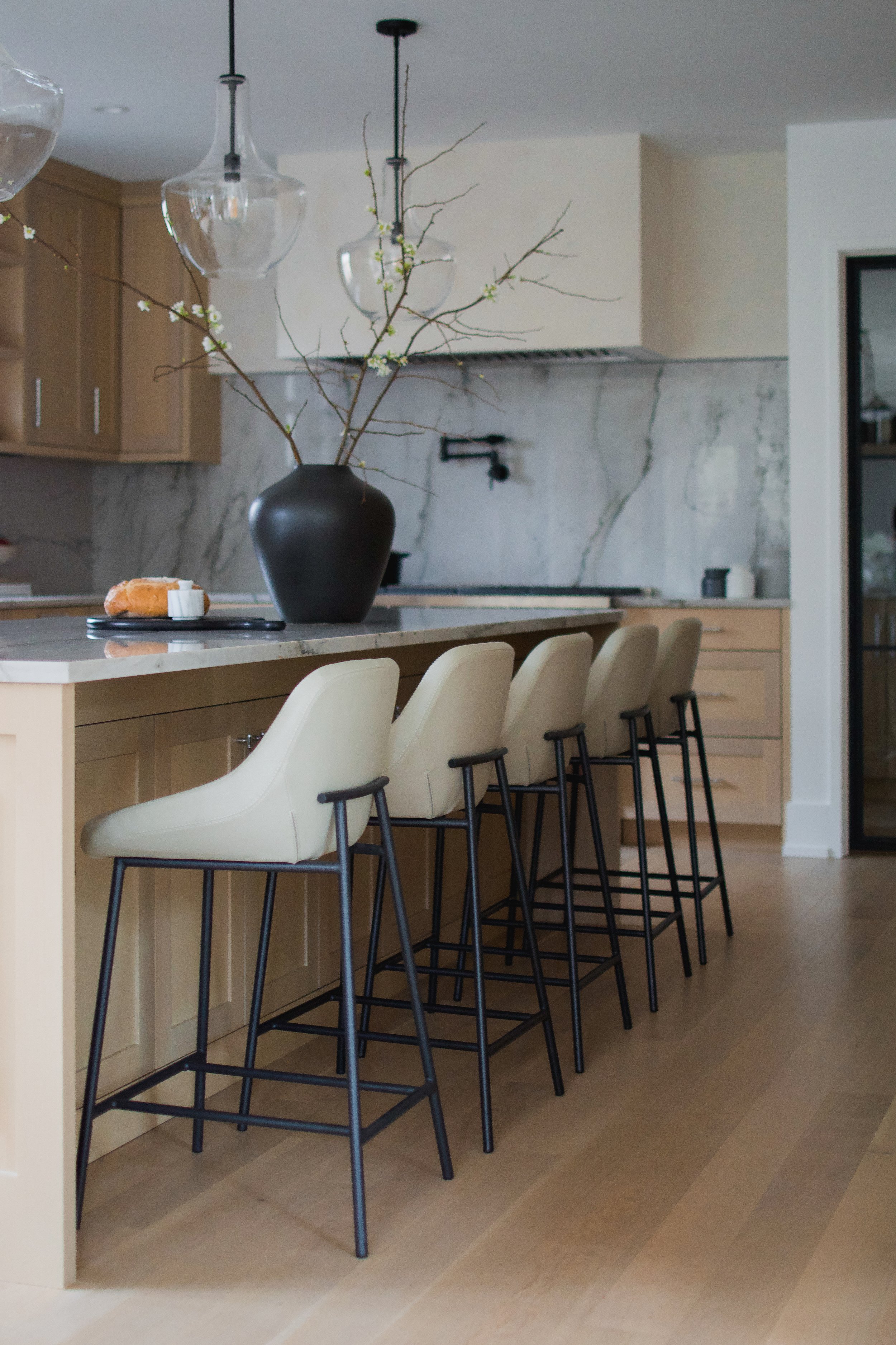
Kitchen
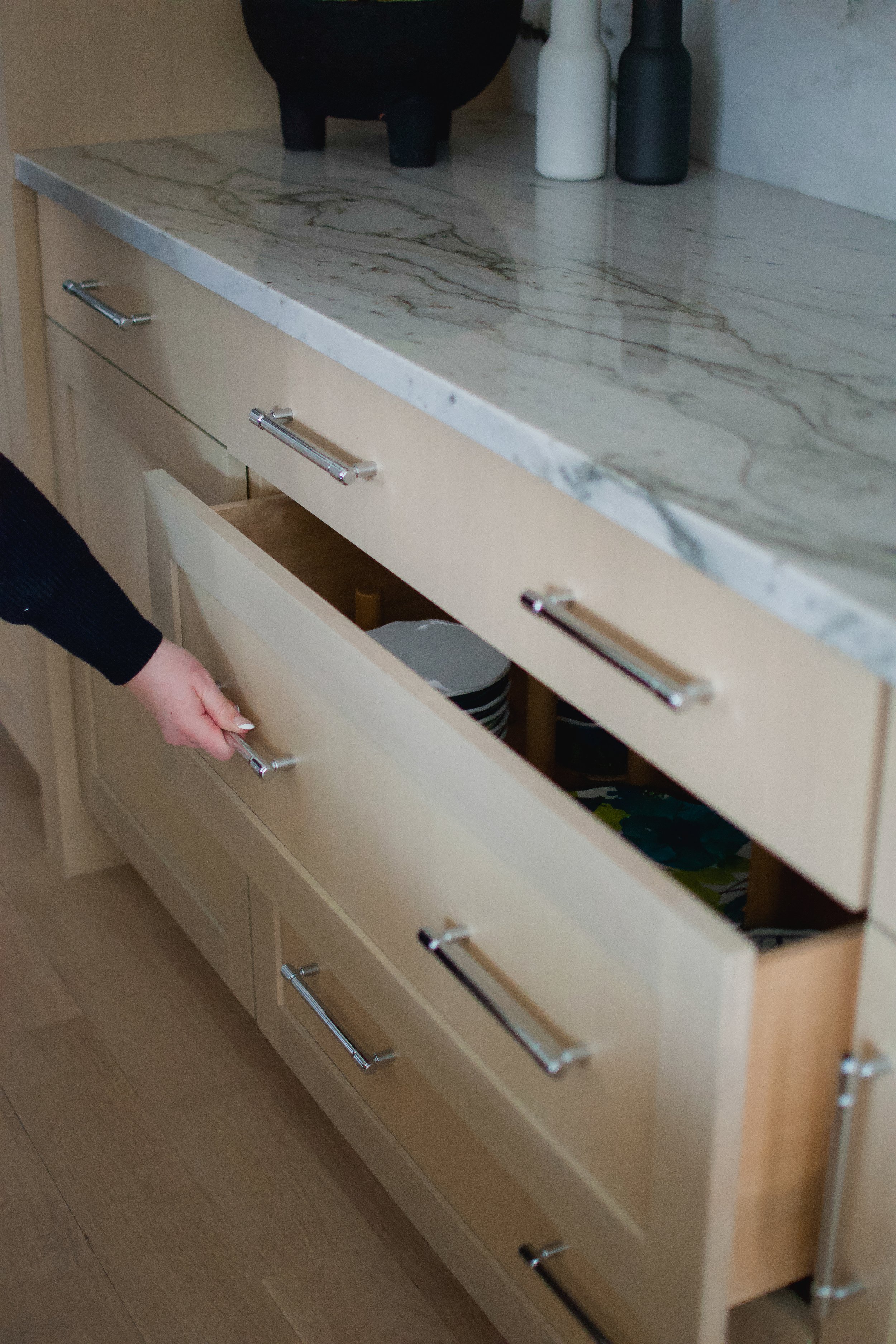
The kitchen is the heart of the home and deserved a really special design. With its new location at the back of the home, DGI was able to design a space perfect for cooking elaborate meals and gathering as a family. We selected natural materials like white oak cabinetry, Opus Quartzite countertops, and a plaster hood to incorporate rich, organic texture. It was important to create functional storage solutions within the custom cabinetry. One way we did this was with extra deep drawers housed with adjustable pegs to safely store plates and bowls. We also opted to conceal all appliances with cabinetry panels for a clean and seamless look. Behind the kitchen, we tucked a large pantry with plenty of additional storage and a prep sink.


Living Room
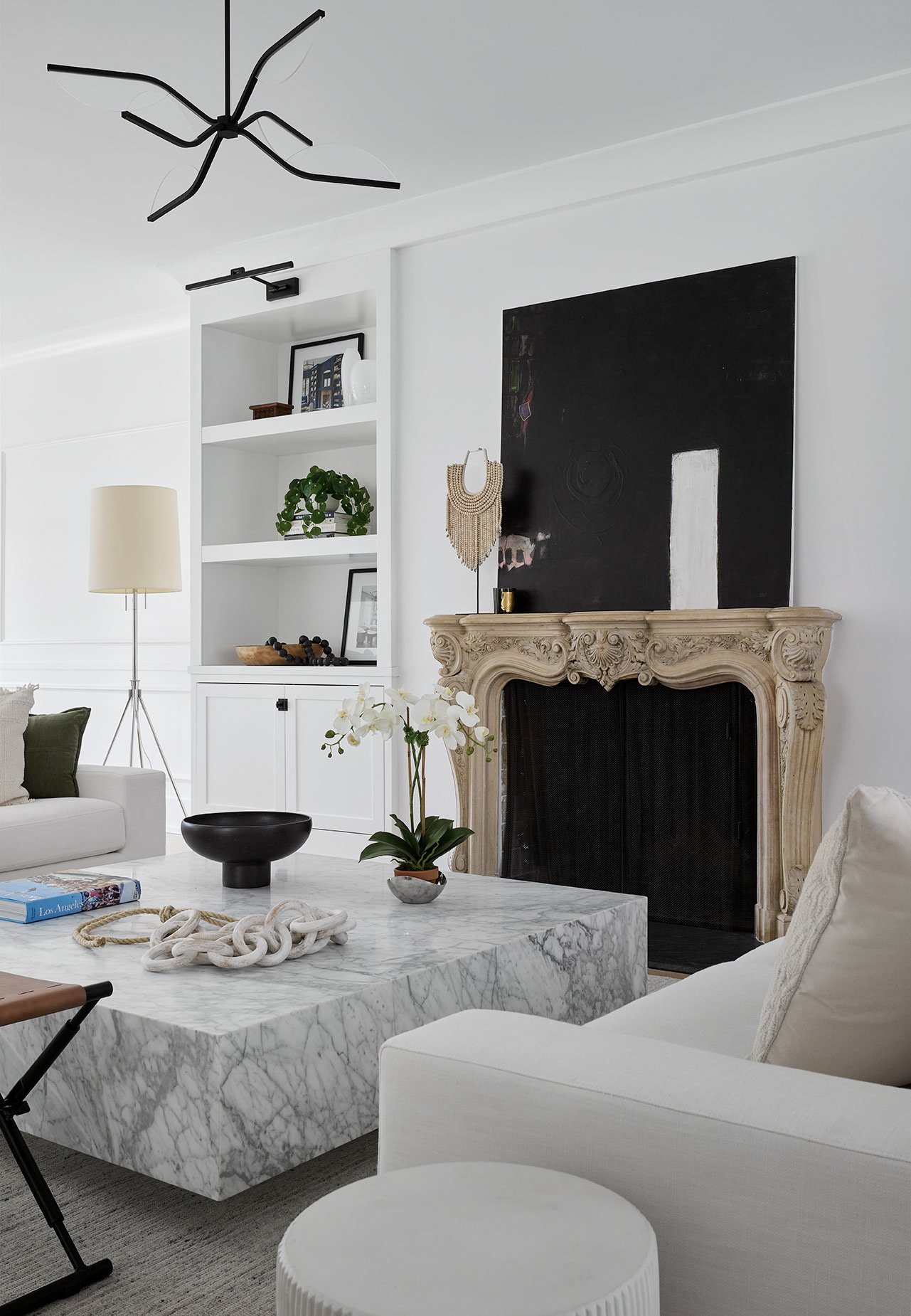
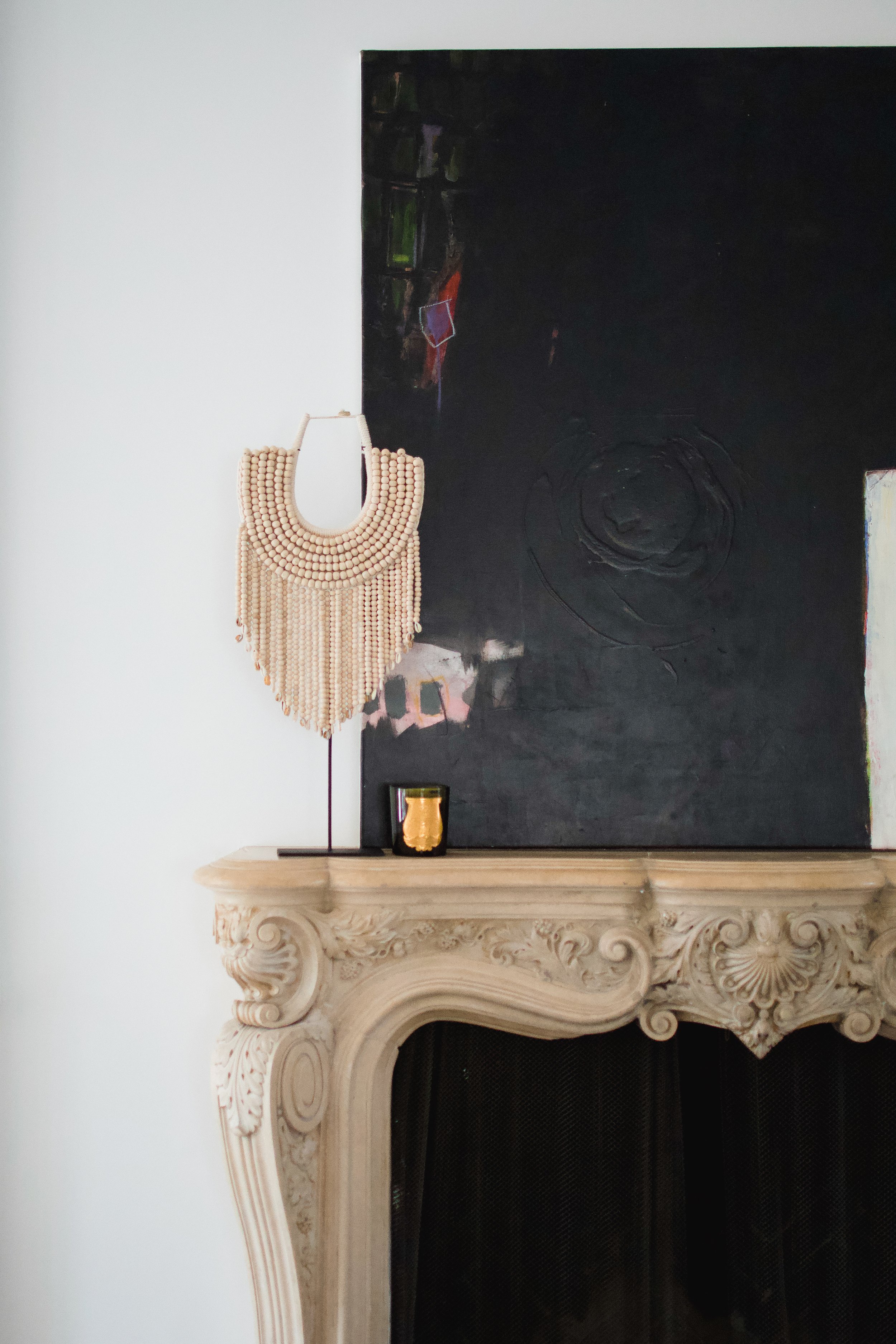
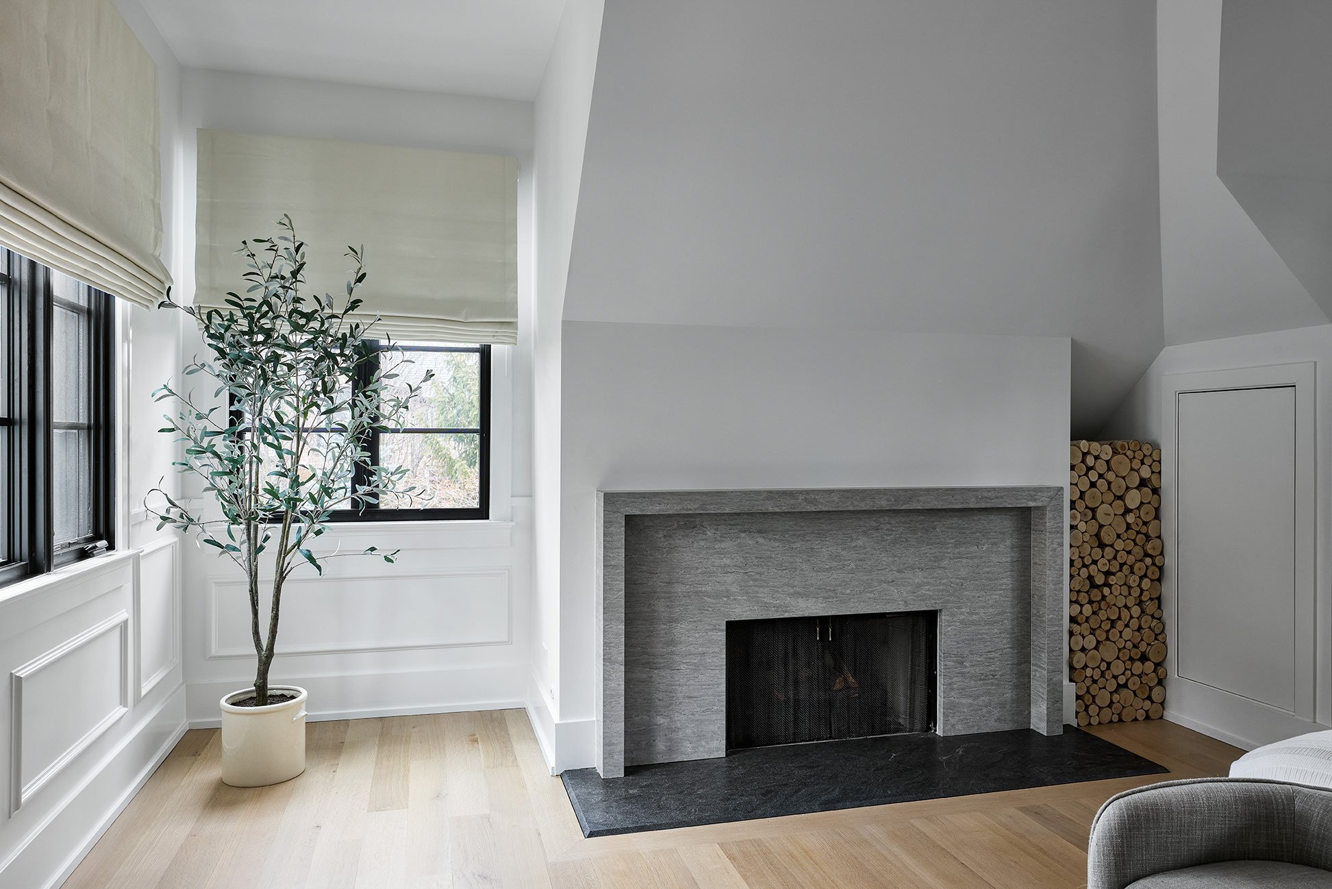
In the living room, we wanted to give a nod to the original 100-year old home, so we opted to keep the existing stone mantle at the fireplace. It creates a beautiful focal point at the center of the room, which we highlighted with custom white built-ins on either side. The crisp and clean built-ins help give the fireplace a fresh, modern look that feels cohesive with the rest of the home.


Powder Room
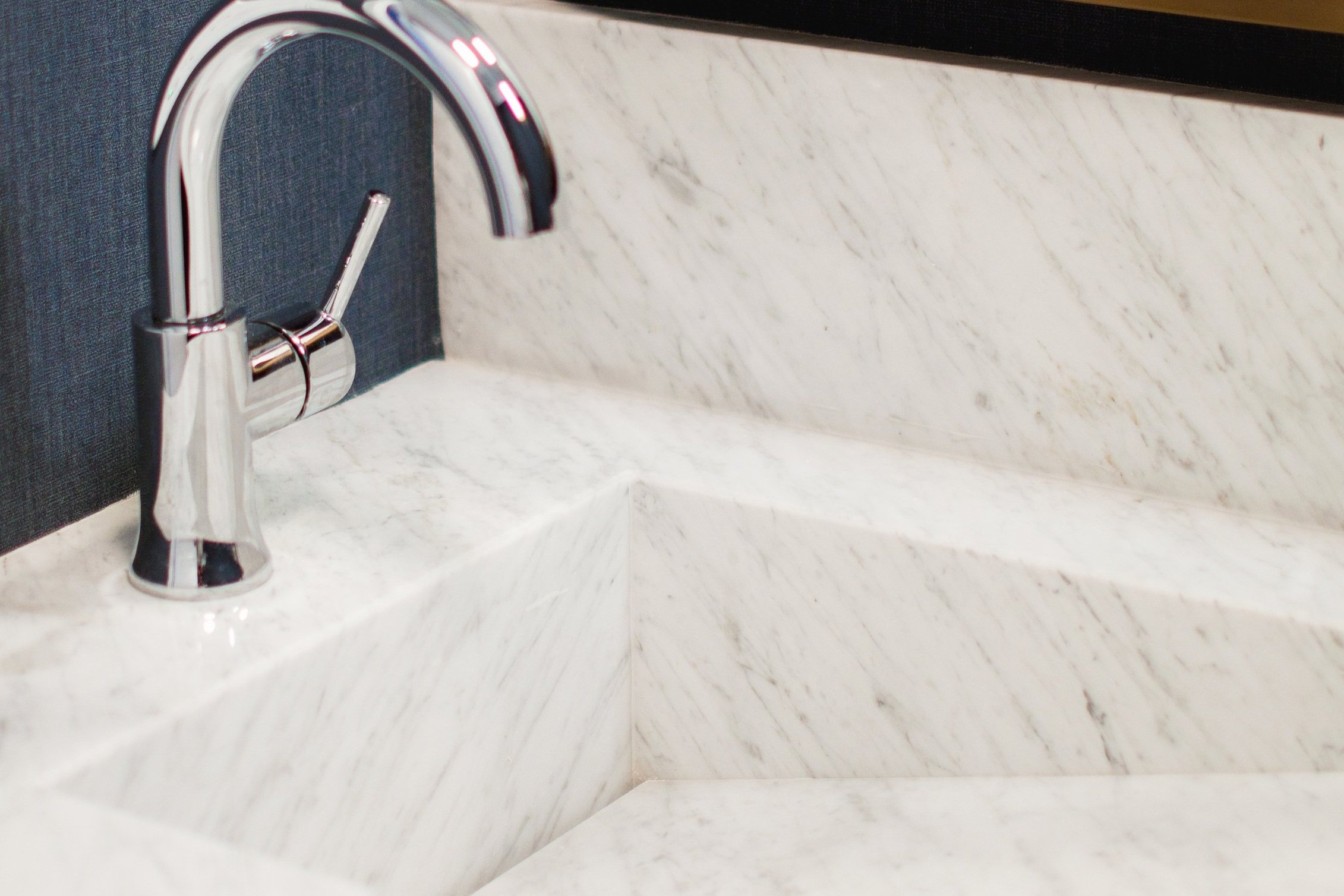
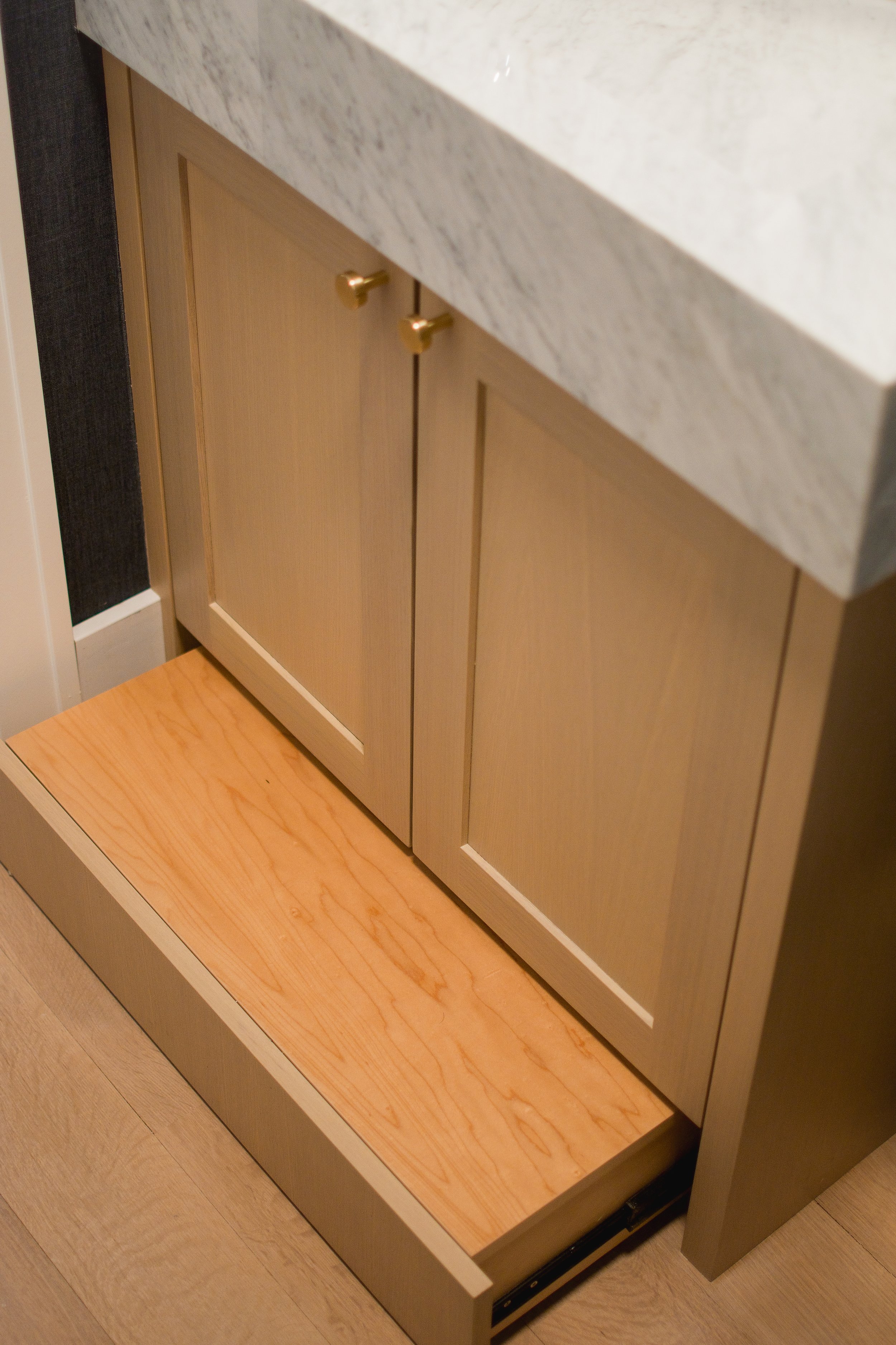
We carried a pop of navy blue into the powder room with a textural wallpaper, and we paired it with a white oak vanity and brass accents to add some contrast and warmth. We designed an integrated sink using a beautiful Carrara marble to give the space a sophisticated feel, and we offset the faucet to the left of the sink for an unexpected, modern touch. At the toe kick of the custom vanity, we designed a push-to-open step stool so the family’s young children can easily reach the sink.


FAMILY Room Built-ins
We carried the same language from the living room built-ins over into the family room for a seamless flow throughout the main floor. Large white open shelves flank both sides of the cased opening into the formal dining room for a dramatic effect. The space provides an opportunity for the owners to add a personal touch to the space with books and keep-sakes. DGI also wrapped the dining room walls with applied molding that gives the space a sophisticated feel.


Office
We carried the same applied molding into the home office, but this time we covered the walls in a bold navy blue paint to give the space a moody and monochromatic feel that stands out from the rest of the home. Behind the floating desk, custom built-ins were designed to look as though they were carved out of the wall in order to create the perfect Zoom backdrop, as well as a portal camouflaging the entry to the ensuite bathroom. In the ensuite bathroom, we carried in the same moody, masculine color palette for a cohesive feel.


Primary Bedroom
In the primary bedroom, we wanted to create a really minimal and serene escape for the owners. We carried in the same applied molding seen throughout the rest of the home to create a seamless feel. Then, we installed a beautiful limestone surround at the fireplace with really clean lines to give the bedroom a modern and minimal look. The organic texture of the stone helps to create an inviting feel in the space, and we designed custom roman shades to complete the design with a sophisticated touch.

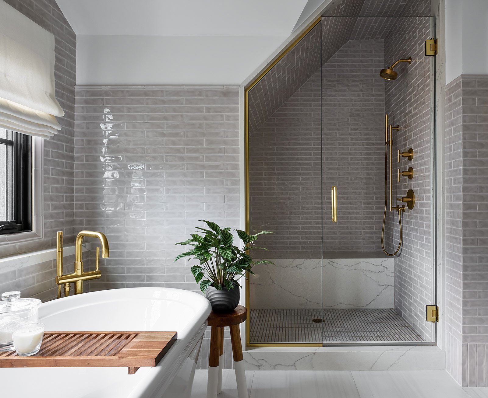
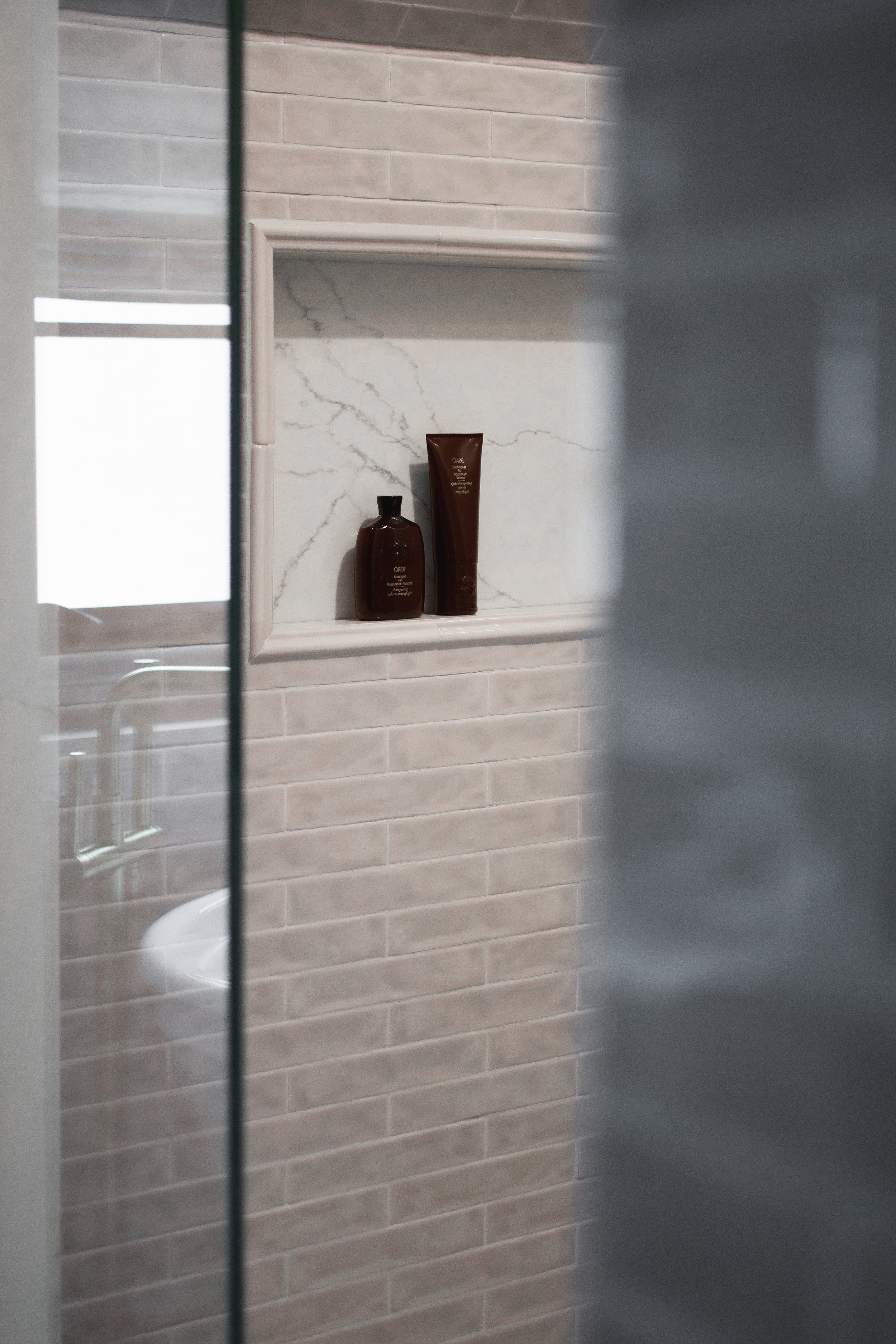
Primary Bathroom
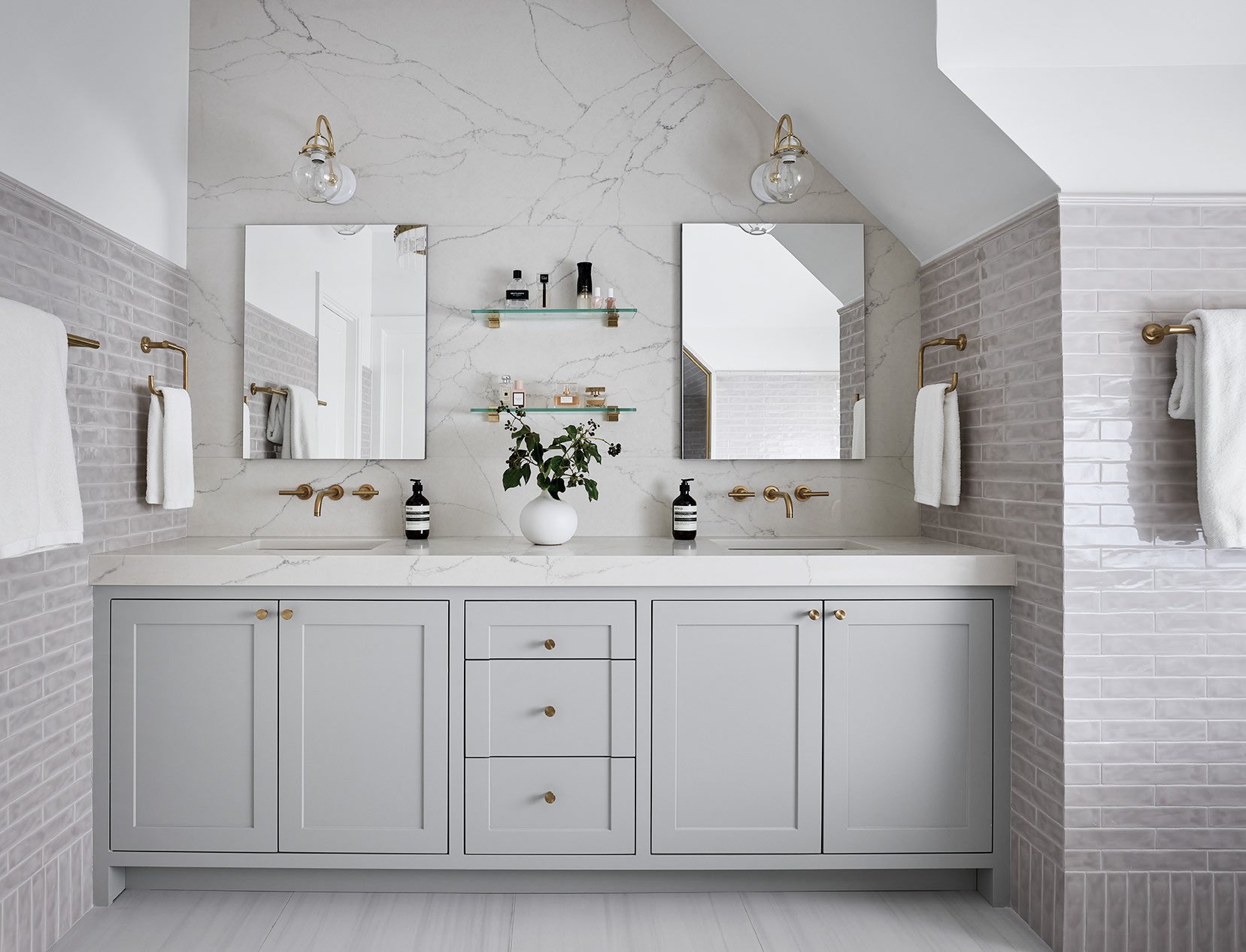
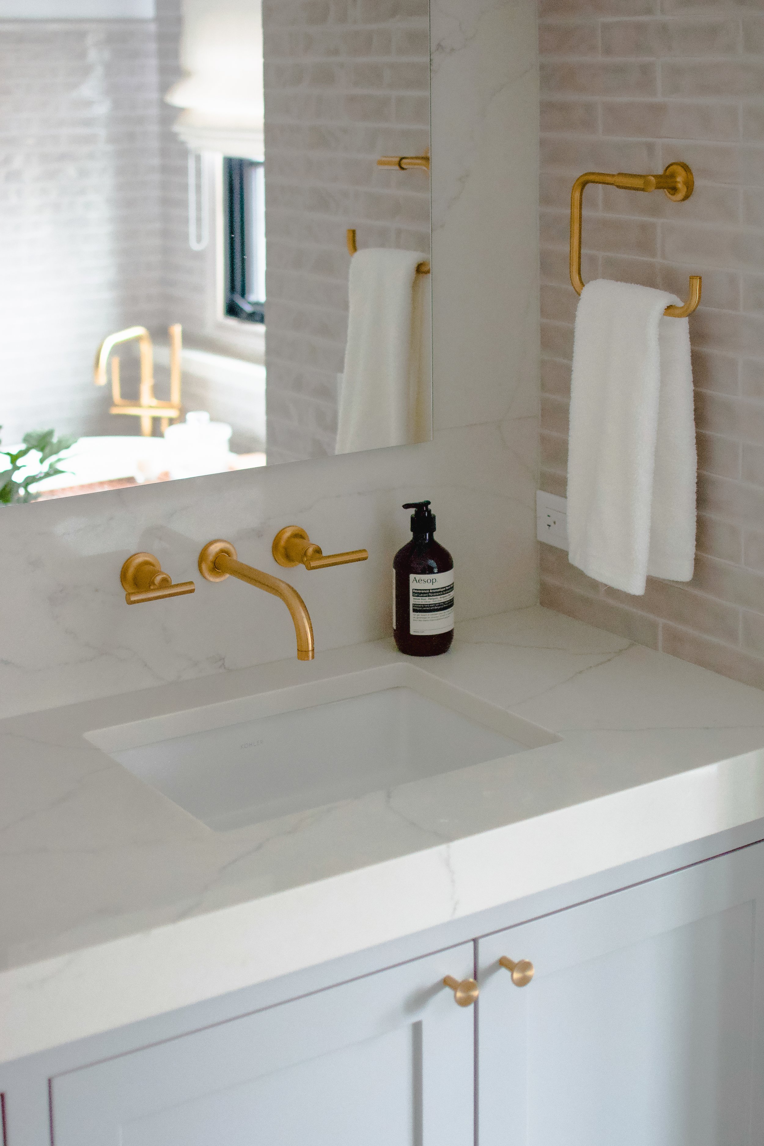
We kept the palette neutral and monochromatic to create a really calming and serene environment in the primary bathroom. The walls are wrapped in a delicate, high gloss tile with a handmade texture that create a beautiful effect on the walls. We strategically played with the tile layouts to add even more detail, installing the bottom row vertically to create a “baseboard” and capping the transitions with a pencil trim piece. At the vanity, we opted for a warm gray finish and shaker profile to give a transitional look, and we paired it with a clean quartz countertop that extends all the way up the wall for a sleek and modern effect that draws your eyes up, celebrating the unique, vaulted ceilings.


KIDS BAthroom 1
For the shared kids bathroom with a Jack-and-Jill layout, we designed a clean and neutral space with pops of blue. We opted for separate vanities so that both kids can enjoy their own designated space in the shared bath. We covered the walls in a glossy white subway tile with framed edges that was installed in a vertical stacked layout for a classic look with a modern twist that will age timelessly with the young kids. Matte black accents complete the space with a modern touch.


KIDS Bathroom 2
For the other kids bathroom, we kept the palette neutral and fresh with soft, off-white tiles and a white oak vanity. The vanity has the same shaker profile used throughout the rest of the home, but the floating effect gives it a modern touch that stands out on its own. Textural tiles and polished chrome accents give the space a clean and timeless look.


Guest Bathroom
In the guest bathroom, we carried over the same textural tiles and polished chrome accents from the other bathrooms to create a cohesive flow between the spaces. We wanted to keep this bathroom really fresh and inviting for guests, so we opted to finish the vanity in a soft white to give the space a monochromatic feel. Veining in the countertops and floor tile add some organic texture to the space to complete the design.


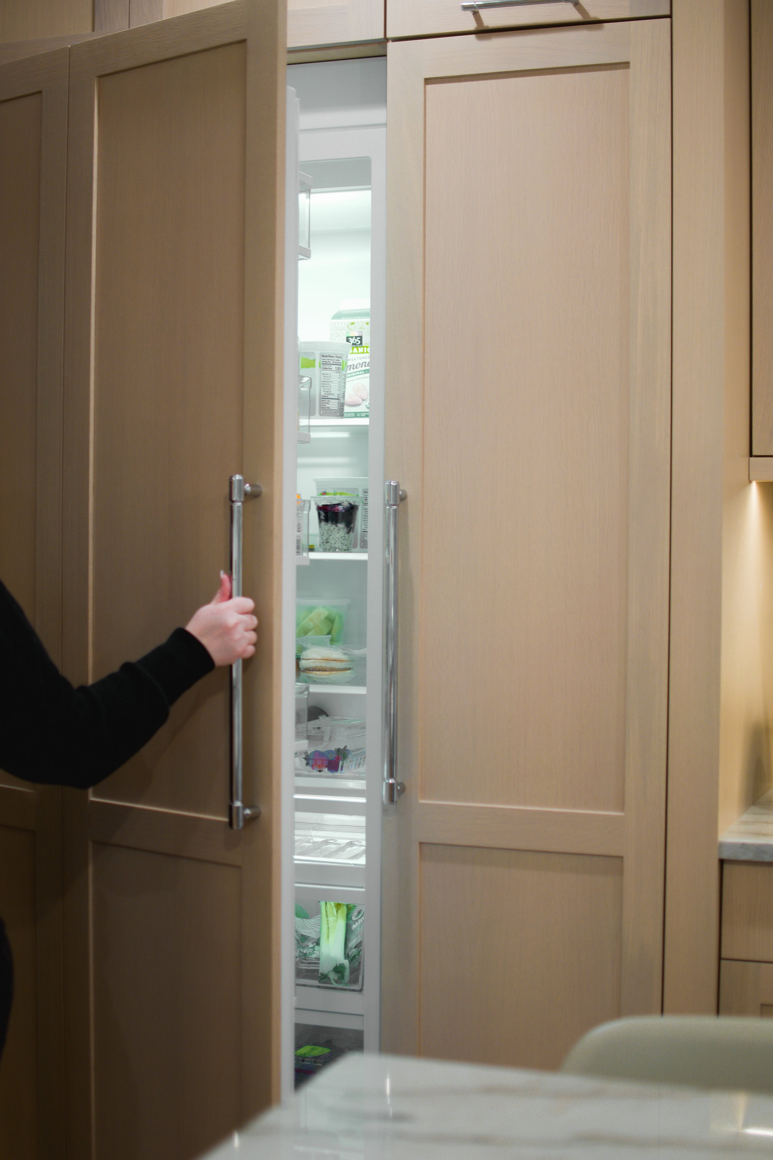
Mudroom
Remember that dark and dated existing kitchen? We transformed that space into a spacious and functional mudroom with designated zones for the whole family. We gave the space a fresh and modern feel with a combination of white oak and navy blue custom cabinetry. Right off of the garage, we designed a coat hook and open cubby station for easy access to everyday shoes and jackets. Next to it, we installed open shelving for even more storage and a utility sink. In the center of the room, we installed a wall of locker-style closed cabinetry for tucking away the kids’ backpacks and winter accessories. Finally on the other side of the room, we designed a custom homework station and computer desk so the kids have a designated zone for school work and other crafts.


Finishing Touches
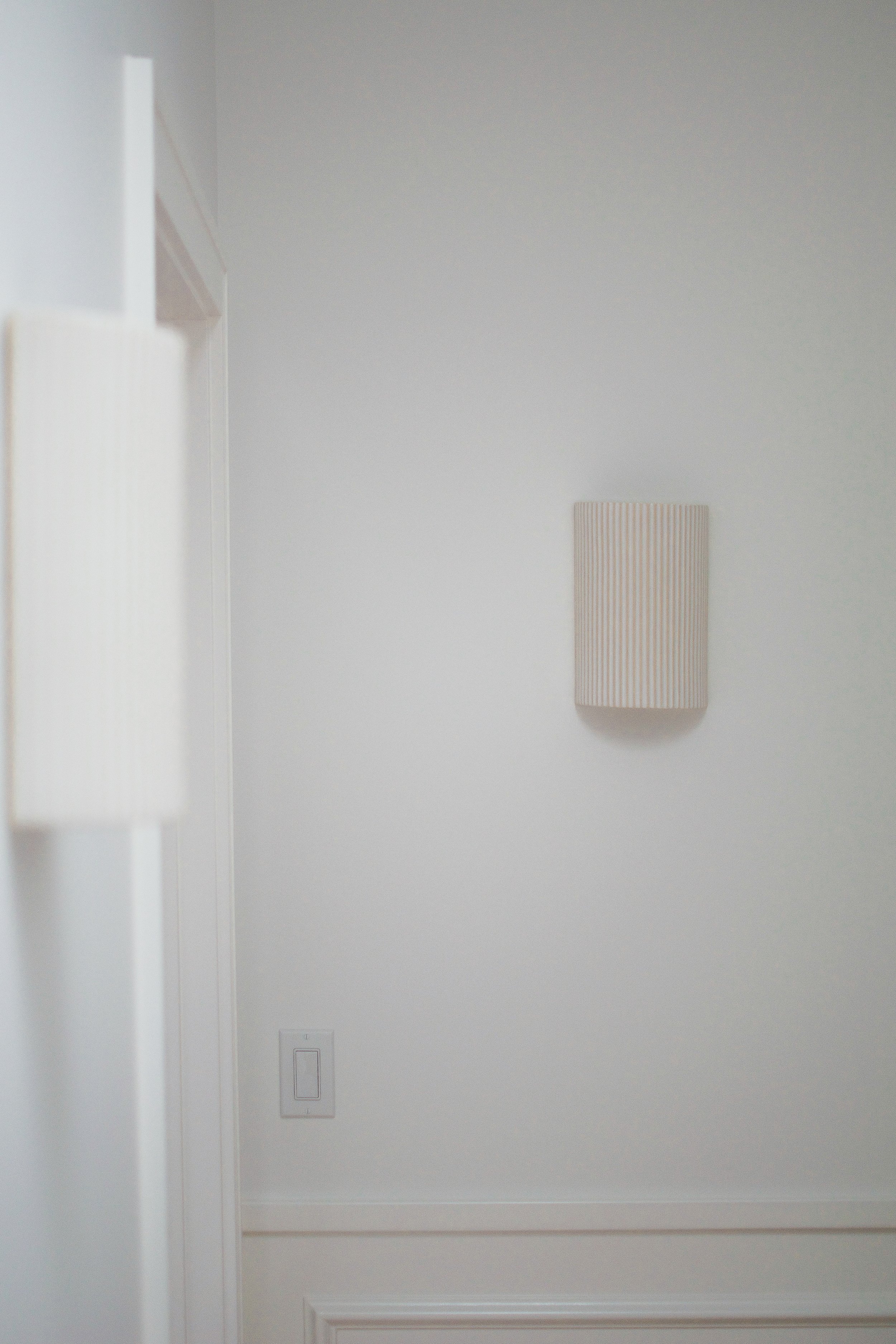
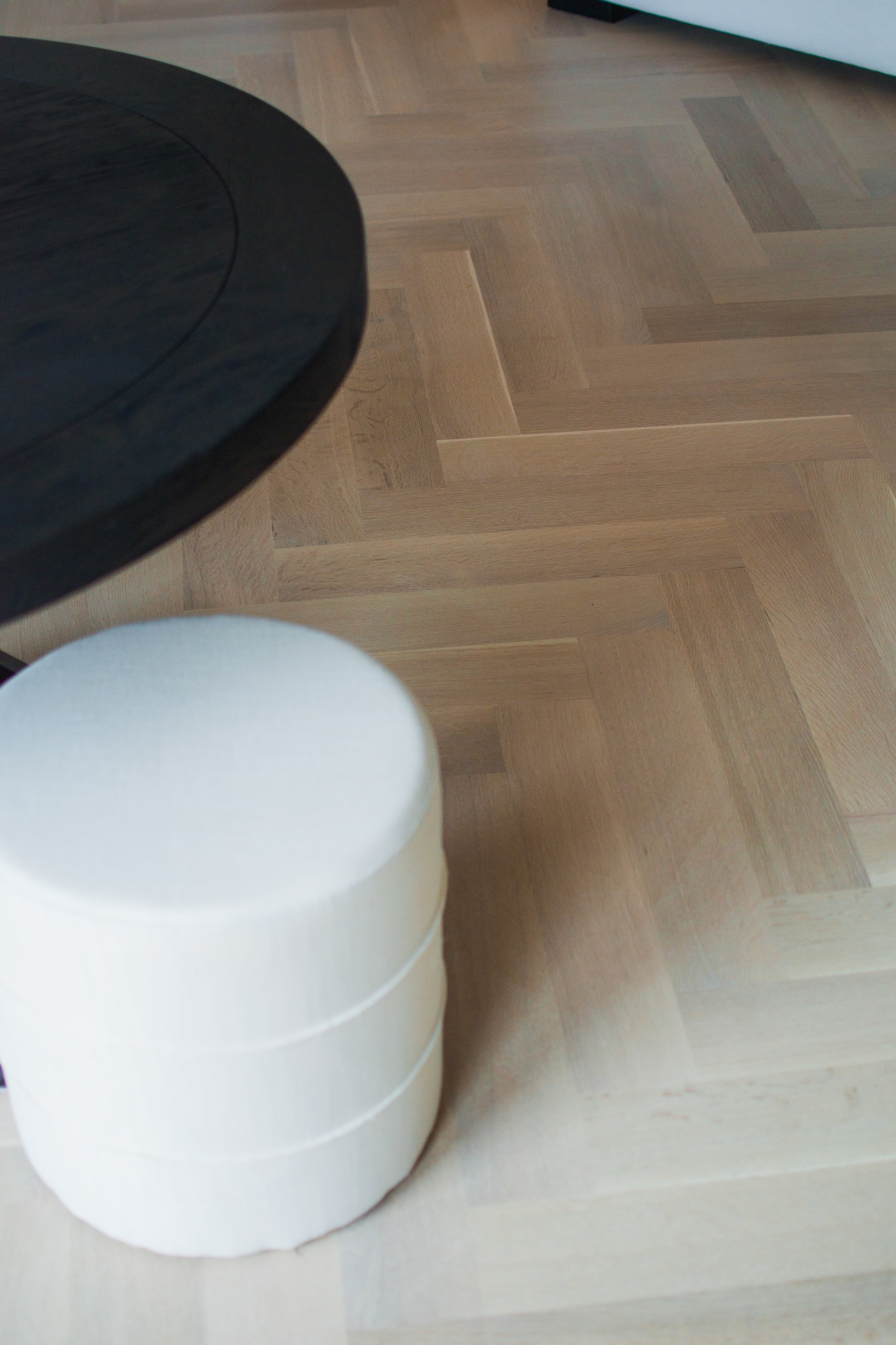
There are so many little details throughout the home that come together to create a cohesive, timeless design. Finishing touches like the herringbone hardwood floors, applied moulding, and soft white palette go a long way in helping a house feel like a home.


We decided to tuck a laundry room into the landing at the top of the second floor, but we didn’t want to create an eyesore. So we got creative and designed seamless push-to-open doors that conceal the washer and dryer.
Conclusion
This project was a special one, and we are so glad to finally share the full tour with all of you! I hope you enjoyed following along and maybe even picked up a few ideas to use as inspiration for your next home renovation!
-dgw